Mark Cavendish: Never Enough

NeverEnough

Netflix

Pitch Productions

End Client

Netflix

Agency

Pitch Productions

Role

Art Direction, Creative Direction, 2D + 3D Motion Design, Compositing

Ended Up

Netflix Worldwide

My creative friend Anthony & I were given the opportunity I'd been dreaming of for years; to create a title sequence for a documentary commissioned by Netflix for worldwide streaming.

Whilst the budget and brief were very minimal, we wanted to put our everything into this being our first long-form title sequence.

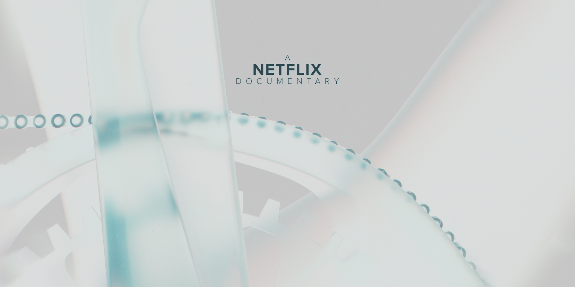
After watching a cutdown of the film we knew which creative direction we wanted to take. An athlete's career is a fragile one; one injury could cost them their livelihood. As human beings they are vulnerable, but continue to power through with what they do. We decided to represent this with a racing bike made of glass.

We started with two routes; one being a light, clinical - almost x-ray like environment. The other a dark, moody and somewhat mysterious.

We also wanted to tell a story in the sequence. So  we thought it would be quite interesting to follow the journey from human power to machine power and the synergy between cyclist and cycle. We figured that the chain was the driving force between the two. We start where Mark's body meets the bike; the pedals, follow the chain around to the derailleur at the back of the bike, up through to the gears and then ending on the back wheel.

You can watch the title sequence with the whole film on Netflix.

Initial Idea

One of our first thoughts when given the brief of creating a title sequence for a documentary about cyclist Mark Cavendish, was to use a series of detail shots of a bike to symbolise the dissection and analysis of career that the documentary was aiming to achieve.

Our main concern however was how to feature a bike in our shots, whilst efficiently use our time and resources. Our solution was to source a high quality model of a racing bike, and create an abstract material to apply to it to create a bike that would be more of a piece of art than functional bike. Combine with some cinematic lighting and camera moves, we could create multiple detail shots that could be fine tuned and animated all using the same rig.

Material World

During our exploration into materials we settled on two ideas to present to the client; a reflective transparent glass, or a translucent white polymer (highly inspired by our love for Patrick Clair's Westworld title sequence). Another advantage of our choice of using a 3D pipeline, is that we could play with different lighting styles, and both of these materials were great examples of how drastically different they look under different lighting.

We decided that the high-key, airport-scanner-style fitted best with the clinical and precise nature of the film.

In the gallery above are some examples of some big lighting changes to choose our style.

Extra Bits

It was my job to composite all of the 3D render passes, dust, lens flares, typography and other 2D elements which help help make the piece that little bit more "ooooo". The biggest challenge I found with this was working in ACES colour space - making sure everything was set to the correct colour space. You sure knew when it wasn't, but it was a challenge to fix it. I had never worked with it before, but WOW was it super. Having a good relationship with post-house, The Farm, we were able to gain a quick understanding of it and what was needed. I will definitely be using ACES again in the future.

My talented musician friend Dean McGinnes, kindly helped us with some music for our director's cut. Be sure to check his stuff out.

Thanks for taking the time to read this far. It's an honour to share this monumental achievement in my career; to create a title sequence for a film. Hoping it's the first of many.